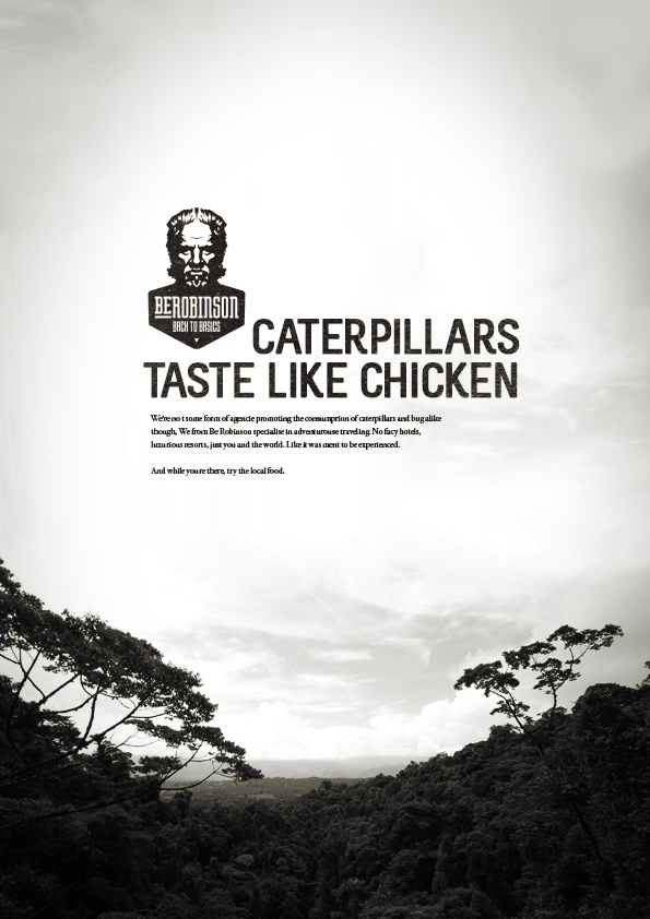
Be Robinson
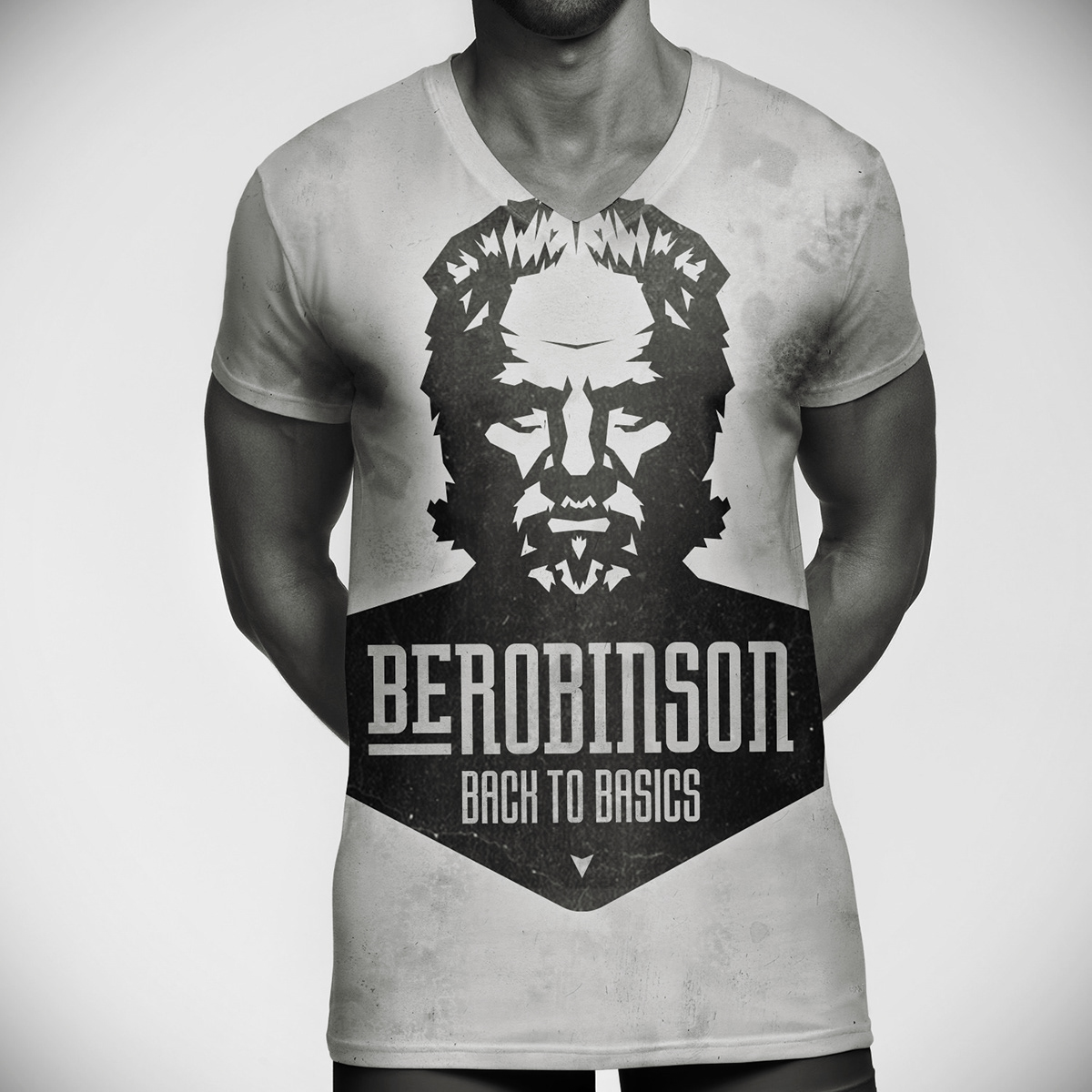
Logo design
A logo design for a fictional traveling agency.
The logo needed to reflect the agency's specialty in basic, adventurous traveling. This was achieved through the use of a bold, engaging icon portraying a Robinson like character, the use of mostly strait lines and a dominant black color. The simplicity of it's shape and the use of just one color also allowed the logo to be applied to any form of media and branded object in a cost effective way.
The logo needed to reflect the agency's specialty in basic, adventurous traveling. This was achieved through the use of a bold, engaging icon portraying a Robinson like character, the use of mostly strait lines and a dominant black color. The simplicity of it's shape and the use of just one color also allowed the logo to be applied to any form of media and branded object in a cost effective way.

Want to find out more information and examples of what 3rd Floor could do for you and your business? Have a look on www.3rd-floor.org

